

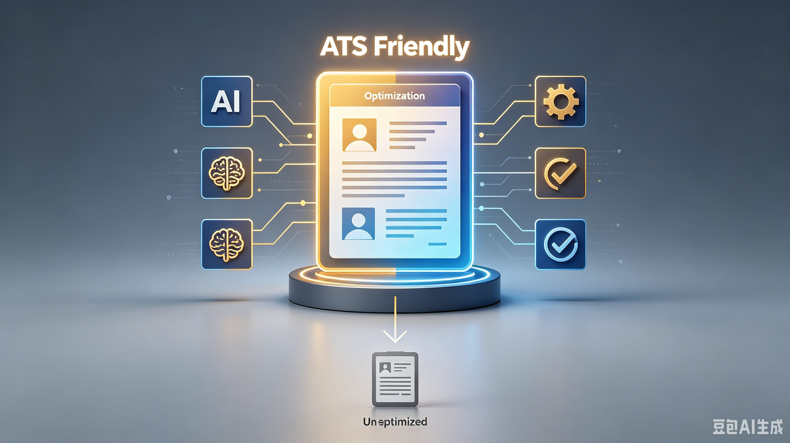
Stop Getting Rejected: The ATS Resume Text Format That Actually Works
In this guide, you'll discover:
🎯 Key: 1. The core principles behind 2. Step-by-step implementation tactics 3. Common mistakes to avoid 4. Proven strategies for better results
Table of Contents:
1. Why Your Fancy Design Is Getting You Deleted 2. The Only File Types That Survive the Filter 3. Standardize Your Headings for Machine Reading 4. Font Choices That Don’t Make Me Squint 5. Keyword Optimization Without the Spam 6. Common Formatting Mistakes That Trigger Auto-Rejection 7. FAQs About ATS Resume Formatting 8. Final Warning: Clean Up Your Act
Stop Getting Rejected: The ATS Resume Text Format That Actually Works
I’ve reviewed over 10,000 resumes. Most of them never reach my eyes. They get shredded by the Applicant Tracking System (ATS) before I even sip my morning coffee.
You think your creative two-column layout looks sharp? The robot hates it.
It sees gibberish. Your ATS resume text format is broken, and you’re losing a career opportunity because of it.
Why Your Fancy Design Is Getting You Deleted
Recruiters don’t have time to decode puzzles. We scan for keywords. If the ATS can’t read your file, it assumes you have no skills.
Complex graphics, tables, and text boxes confuse parsing software. The system strips out your contact info or jumbles your work history.
Result? Instant rejection.
- Bottom line? No columns: Stick to a single-column layout. It’s boring but readable.
- Truth is, No headers/footers: ATS often ignores these areas. Put your name and email in the main body.
- No images: Logos and photos are invisible to most parsers. Delete them.
The Only File Types That Survive the Filter
PDFs are tricky. Older ATS versions treat them like images. Unless the job posting explicitly asks for a PDF, play it safe.
Word documents (.docx) are the gold standard for parsing. They are lightweight and universally understood by legacy systems still used by many Fortune 500 companies.
File Type
ATS Compatibility
Risk Level
.docx
High
Low
Medium/High
Medium
.pages
Low
High
.jpg/.png
None
Critical
Standardize Your Headings for Machine Reading
Don’t get cute with section titles. "My Journey" or "Where I’ve Been" means nothing to an algorithm. It’s looking for specific markers.
Use standard headings that map directly to database fields. This ensures your Professional skills and experience land in the right buckets.
1. Contact Information: Keep it simple. Name, phone, email, LinkedIn URL. 2. Work Experience: Use reverse chronological order. No gaps. 3. Education: Degree, major, university. Leave out graduation dates if you’re over 40 to avoid age bias. 4. Skills: List hard skills only. No soft fluff.
Font Choices That Don’t Make Me Squint
If I have to zoom in to read your resume, I’m closing the tab. Legibility is not optional. It’s basic respect for the reader’s time.
Stick to standard sans-serif fonts. They render cleanly on all devices and screens. Avoid anything that looks like handwriting or decorative script.
- Arial
- Calibri
- Helvetica
- Times New Roman (acceptable, but dated)
Keyword Optimization Without the Spam
Keyword stuffing is obvious. It makes you look desperate.
But ignoring keywords makes you invisible. Find the balance.
Read the job description. Mirror their language.
If they say "project management," don’t write "led teams." Use the exact ATS resume standard terminology they use.
This isn’t cheating. It’s speaking their language.
The ATS scores relevance based on exact matches. Help the robot help you.
Common Formatting Mistakes That Trigger Auto-Rejection
I see the same errors daily. They are easy to fix, yet candidates keep making them.
It’s lazy. And laziness gets your application deleted.
Avoid special characters and symbols. Bullet points should be standard dots or squares. Arrows, checks, and stars often turn into question marks or garbage code.
Never use skill bars. Saying you’re "80% proficient" in Python is meaningless. Are you better than a junior dev but worse than a senior?
Just list the skill. Let your experience prove the level.
FAQs About ATS Resume Formatting
Should I include a photo on my US resume?
No. Photos are discouraged in the US due to anti-discrimination laws.
They also confuse ATS parsers. Remove it immediately.
Is it okay to use white space?
Yes. White space improves readability for humans.
Just ensure margins are at least 0.5 inches so text doesn’t get cut off during printing or parsing.
How do I handle employment gaps?
Use years only, not months, for dates. This minimizes the visual impact of short gaps. Be prepared to explain them in an interview, not on the paper.
Can I use a two-column template if it’s a PDF?
Risky. Many modern ATS handle PDFs well, but older ones fail.
If you want to guarantee visibility, stick to a single-column .docx format.
Final Warning: Clean Up Your Act
Your resume is a technical document, not an art project. The goal is to pass the bot, then impress the human.
Don’t annoy your recruiter. Use GoatOpt to ensure your resume is clean, compliant, and readable.
Implementation is everything. Re-read the section that resonated most, then close this tab and go do that one thing. Seriously — right now.
Ready to optimize your resume?
Get smart resume optimization tailored for the US job market.
Try Free Now